Deepika Padukone’s Siddhivinayak Temple look on 18 September proves that strong festive colours do not need to compete. Her custom Mayyur Girotra ensemble sets a marigold-orange kurta against deep purple trousers, then lets gold details bridge the two. The result is saturated, but the colour placement keeps each element visually distinct.
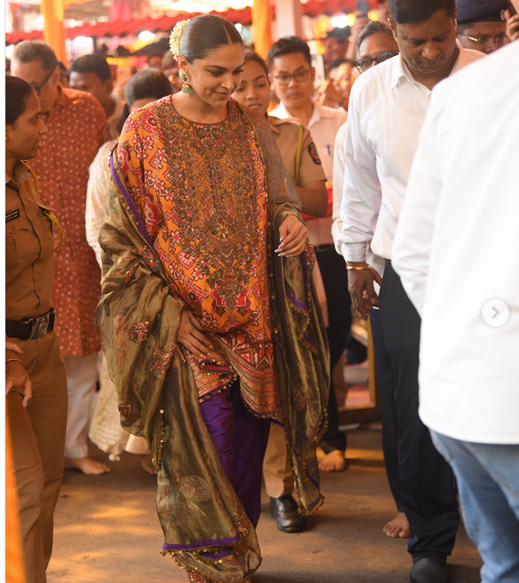
The kurta carries the busiest surface work, with red, ivory and pink details, antique zardozi embroidery and what fashion coverage identifies as signature Patola. Below it, the looser purple trousers create one clean block of colour instead of repeating the kurta’s pattern. A tissue-silk dupatta with appliqué adds shine without introducing another dominant shade, so the palette stays focused on orange, purple and gold.
That structure also gives the accessories a clear job. Deepika’s jhumkas, bindi, gajra and gold-toned footwear do not start separate colour stories; they repeat the traditional and metallic notes already present in the clothes. Styled by Priyanka Kapadia Badani, the look shows how accessories can add detail to maximal Indian occasionwear without making every part of the outfit compete for attention.
For readers who want to borrow the idea, the useful formula is simpler than the full couture look. Start with two saturated colours in separate garment pieces, then choose one metallic family for the finishing details. If the kurta is patterned, keep the trousers comparatively plain; if the dupatta has sheen or embroidery, let jewellery echo that warmth rather than adding a third bright colour. The same balance can work with pieces already in a wardrobe.
Read more on Deepika Padukone turns heads in a graceful Mayyur Girotra's ensemble
The strongest lesson from Deepika Padukone’s Siddhivinayak look is not that festive dressing needs more colour. It is that bold colour works best when every shade has a defined place. Orange leads, purple grounds it, and gold connects the two—a controlled palette that makes a richly detailed outfit feel coherent rather than crowded.